
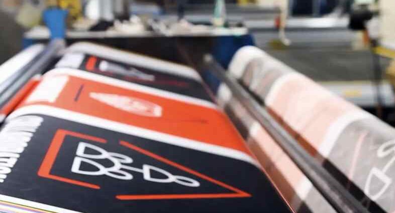
Managing a commercial property, launching a corporate headquarters, or expanding a local retail facility involves balancing two distinct fields of work. On one hand, your operational team must manage daily building logistics—handling facility security, updating directional safety signs, maintaining ground compliance, and ensuring clear pedestrian access routes. On the other hand, you are managing a physical space that relies heavily on clear branding, positive visitor navigation, and distinct street-level community visibility. Because establishing a professional corporate identity requires bold visual clarity, standard office prints or tiny placard signs will simply get lost against massive brick walls and towering concrete glass storefronts.
When corporate facility managers or regional marketing directors look to install exterior building banners, oversized window graphics, or industrial site signage, they spend weeks evaluating architectural fit before production begins. They have genuine structural anxieties regarding long-term outdoor material weathering, exact corporate color calibration across giant surfaces, and whether the installation methods comply with municipal building codes and safety regulations. Regional commercial development assessments published by production networks like AlphaGraphics Brentwood prove that integrating your building’s architecture directly into your print layouts is the most effective way to capture passing traffic. By shifting your approach away from small, disconnected promotional posters and focusing instead on a unified large-format physical installation strategy, you build instant authority and establish an unmistakable local presence.
Match Large-Format Substrates to Your Structural Environment
The foundational step of a successful building print project involves selecting your physical substrate—the raw material your design is printed on—based on where it will be mounted on your facility. Choosing materials purely on base cost without analyzing the structural background usually results in warped signs, peeling adhesives, or dropped panels.
To build a durable commercial signage footprint, match your project needs to these three industry-standard large-format materials:
- Aluminum Composite Panels (ACM) for Rigid Facades: Composed of two thin sheets of flat aluminum bonded to a solid polyethylene core, ACM is incredibly lightweight yet completely rigid. It is the gold standard for long-term exterior building signs, directional entry plaques, and parking lot walls because it will never rust, warp, or crack under extreme seasonal temperature shifts.
- Perforated Window Vinyl for Glass Storefronts: This specialized material features thousands of tiny micro-punctures (typically a 60/40 or 50/50 print-to-hole ratio). It allows you to display massive, full-color marketing images across your building’s exterior glass windows while completely preserving the view and natural sunlight for employees working inside.
- Heavy-Duty Mesh and Blockout Vinyl for Exterior Walls: Solid vinyl banners hang perfectly against smooth interior drywall, but outdoor building wraps require a strategic choice. Open-mesh patterns allow heavy winds to pass directly through the fabric on exposed construction fences, while dual-layer “blockout” vinyl prevents bright background building lights from shining through and washing out your printed graphics.
Design Big: Scale Layouts for Speed and Distance Scanning
Designing a graphic that measures twenty feet wide requires a completely different mental approach than designing a standard magazine ad or a website banner. When a driver passes your building at forty miles per hour, your sign has less than three seconds to communicate your brand identity clearly.
Respect the Viewing Distance Scale
As a core layout rule for industrial large-format production, your text must be scaled for the audience’s physical distance rather than a desktop screen. While a two-inch headline looks massive on an office printer, it becomes completely invisible when mounted fifteen feet up on a building side. For high-impact building signs meant to be read by passing highway traffic from two hundred feet away, your primary text blocks must stand at least twenty inches tall, using bold, clean sans-serif typefaces without decorative serifs or thin scripts that blur together from a distance.
Maintain Strict Resolution and Vector Integrity
Never pull low-resolution images off a website to use on a large-format building print. A small JPEG file that looks sharp on a mobile phone will stretch into a blurry, pixelated mess of blocky squares when expanded across an eight-foot wall panel. Always use clean vector files (such as EPS or PDF formats) for logos, text, and structural line art, ensuring they can scale up infinitely without losing a single ounce of sharp edge clarity. For photographs, your original files should maintain a high resolution of at least 150 DPI (dots per inch) at the actual final output size to keep your imagery looking professional and sharp.
Map the Architectural Wayfinding Journey Chronologically
A common mistake in large facility planning is investing heavily in a massive front logo sign while forgetting to guide visitors once they actually turn into the property layout. Building signage should act like a continuous visual chain that holds a client’s hand from the outer roadway directly to your interior front desk.
[Exterior Pylon or Wall Sign] → [Directional Driveway Arrows] → [Main Entrance Header] → [Internal Directory Map]
To build an organized architectural wayfinding flow across your commercial facility, place your large-format prints in this strategic order:
- The Street-Level Anchor: Mount your primary brand identification sign as high as local zoning allows on your main street-facing wall to establish immediate geographic presence for drivers.
- The Junction Deciders: Place intermediate rigid panels at every parking split, garage entrance, or loading dock lane to separate commercial delivery trucks from standard client parking traffic.
- The Portal Clarifier: Use an architectural entryway banner or distinct dimensional graphics directly above your primary glass entry doors so visitors never have to guess which entrance leads to the main lobby.
- The Lobby Landing: Position a clean, high-contrast structural directory board immediately inside the main doors, organizing suite numbers and department names alphabetically for fast scanning.
Enforce Strict Installation and Environmental Safety Audits
Large-format prints mounted to commercial buildings represent substantial physical structures, meaning your anchoring methods and installation hardware must prioritize public safety and code compliance. Displaying these giant visual assets securely requires professional attachment protocols to withstand severe weather events.
Use Through-Bolt Anchors and Solid Structural Frames
When mounting rigid aluminum composite signs to exterior brick or concrete block walls, never rely on simple construction glue, thin drywall screws, or plastic anchors. Heavy outdoor signs require heavy-duty sleeve anchors or galvanized steel through-bolts driven deeply into the building’s structural masonry. For large vinyl wall banners, installing a tensioned aluminum track frame along the perimeter keeps the fabric locked tight like a drum head, preventing the material from flapping violently in high-speed storms and snapping its anchor points.
Audit Signage for Ultraviolet and Physical Degradation
Walk around your facility’s exterior twice a year to inspect your building graphics for sun bleaching, wind fatigue, or adhesive lifting. Direct exposure to intense ultraviolet (UV) sunlight will break down standard printing inks within a single season, causing rich brand colors to fade into dull gray tones. To prevent this, ensure your print provider applies an industrial UV-resistant matte over-laminate film layer across all exterior graphics during production. This protective layer acts like sunblock for your sign, sealing out moisture, preventing scratches, and extending the life of your building investment.
Align Public Physical Graphics with Corporate Brand Systems
Most established regional corporations, medical facilities, and commercial developments looking to maintain high client trust understand that physical presentation directly reflects their internal organizational quality. If your exterior building wrap displays an old corporate logo, mismatched colors, or an outdated phone number, clients will perceive your business operations as scattered or uncoordinated.
Perform a thorough brand check before finalizing your large-format file submissions. Ensure your exact corporate Pantone color codes, official fonts, and updated web directories match perfectly across your exterior facility signs, corporate fleet vehicle wraps, and primary digital platforms. Taking these standard corporate precautions ensures your facility stands out as a landmark of professional authority from the exact moment your large-format prints are securely anchored to the wall.